
Tryptic
"Soliloquy" |
91.44x60.96cm
|
|
|
|
Exhibition Text
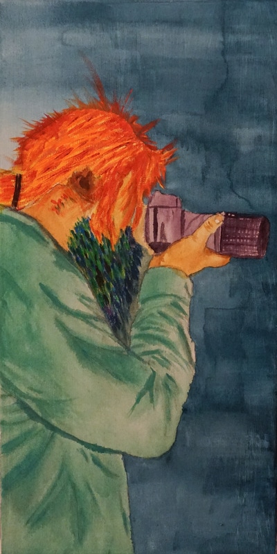
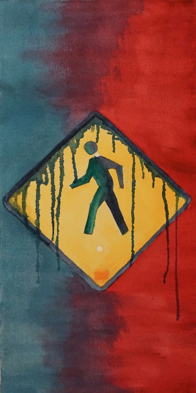
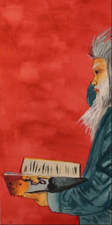
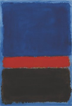
"Soliloquy" is a tryptic inspired by the work of Mark Rothko and the art movement Expressionism. Through the depiction of my two mediums of expression, photography and poetry, the piece demonstrates the duality of then and now. The use of vivid colors connects the pieces into a story that encourages personal interpretation. I aimed to make the viewer think and consider the impact of time on people as well as the impact of the world on the artist.
Process
Brainstorming |
Planning |
|
1. Write down potential ideas, stories, artistic inspirations and metaphors you can incorporate into your piece.
|
2. Create two to three planning sketches. Incorporate concepts from your brainstorming. Take into consideration that the piece must tell a story.
|


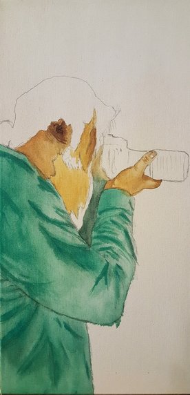
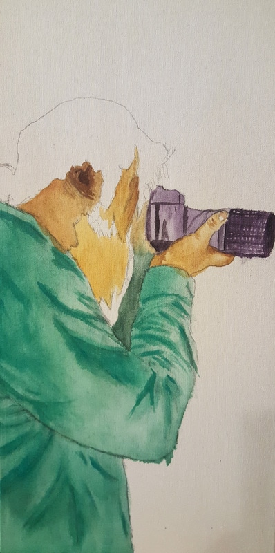
Photograph Subjects3. Photograph the subjects you will be painting. Place the subject in front of a clear background; if you are the subject, position your camera on a tripod and use a self timer. For outdoor subjects, position yourself directly in front of the subject to avoid any distortion. Try to photograph the subject in front of a relatively clear background. Once the shots are taken, crop the photos and increase the sharpness of the photos.
|
Canvas Preparation4. Stretch three 60.96 cm by 30.48 cm canvases.Then, using a 1.5 inch (38.1 mm) brush, apply an even coat of white gesso to the canvas. Apply the gesso in one direction to ensure a smooth painting surface and allow the canvases to dry.
|


Transferring Images5. Project your images onto the three canvas and outline the subjects by tracing the projections with a pencil. Be sure to trace highlights and shadows.
|
|


Painting
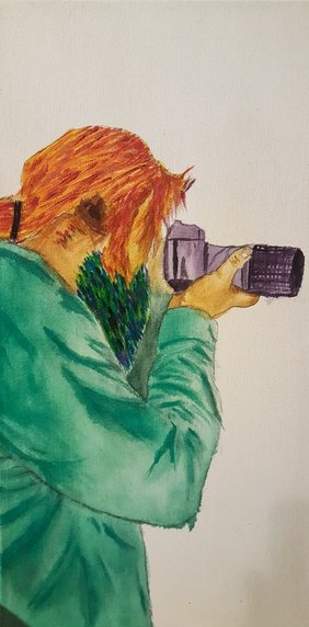
6. Paint the canvases in chronological order. This allows you to connect the canvases to form a coherent story. Start by mixing a skin tone of red, burnt umber, yellow, and white. Add copious amounts of water to the skin tone. Then, using a size 3/4 inch flat brush, apply the hue to the face and hand. Vary the intensity of the color by using differing amounts of water on the brush. Refer to the photographs to determine how light affects the subjects. Next, mix a blue - green hue for the shirt. Once again, vary the intensity of the color to accentuate the shadows and wrinkles of the fabric. With a size 8 flat brush, paint the bearded areas with cool colors using quick flicking strokes. With the same brush and technique, paint the hair in red and orange hues. Then, paint the background blue with the 3/4 inch flat brush. The blue hue should be watered down substantially to achieve a light wash. Be sure to vary the intensity of the background color by applying differing amounts of coats to different areas.
|
|
|
7. For the next canvas, mix an orange and yellow hue with water. Using a 3/4 inch flat brush, apply the hue to the crosswalk sign with even layers of consistent intensity. Paint the walking figure with two hues, a dark green and dark blue. Then, create a thick outline of the sign in a dark blue - green hue. Add copious amounts of water to this color and allow the brushes of the 3/4 inch flat brush to soak up the paint. Then, dab the brush into the top border of the sign. Allow the paint to naturally fall down the canvas. Once the paint has dried, paint the background with the same blue used in the background of the first canvas. Start with this hue on the left side of the canvas and stop at roughly halfway through the canvas. Using a red hue, paint the right side of the canvas until it is thoroughly covered. In the middle of the canvas, where the two hues meet, use the 3/4 inch flat brush to blend the two colors to form a violet hue. Use long dramatic horizontal brush strokes for a visibly rough texture.
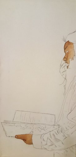
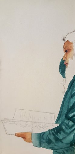
8. For the final canvas, mix a dark blue-green hue and dilute it with copious amounts of water. Paint the shirt with the same technique used in the first canvas and vary the intensity of the hue to create dramatic shadows. Then, mix a skin tone of burnt umber, yellow, and white and dilute it with water. Apply the paint with a 3/4 inch brush to the necessary areas and make sure that the shadows and highlights contrast. The paint should also leave a rough texture to the skin to imply wrinkles and age. With a variety of gray and white hues, paint the hair using long flicking brushstrokes. The hair on the head should curve upward while the facial hair can be represented in all directions. Once the hair is painted, apply paint to the notebook. Finish the canvas by painting the background with the same red hue used in the middle canvas. Ensure that brushstrokes are visible on the background of the canvas.
|
|
Experimentation
|
When painting, experiment with a variety of brushstrokes. For the most part, I used a ¾ inch brush exclusively to paint. In some cases, I used a size 8 brush for finer details but for a majority of the piece, I aimed to use a larger brush. Combined with a quick, flicking stroke, the brush left a rough and textured look that allowed my intent to translate onto the canvases. In addition to brushstrokes, I experimented with the intensity of colors. By diluting acrylic paint with varying amounts of water, the opacity and intensity of the paint changes. Furthermore, by applying paint in separate layers, I managed to achieve contrasting backgrounds with singular colors. These two methods enabled me to emulate the work of Mark Rothko and his Color Field pieces. Furthermore, the varying opacities of the paint combined with the layering technique allowed me to add more depth to shadows and highlights. By diluting the paint with water, the medium became increasingly runny and easier to manipulate. This freed my creativity and helped materialize my ideas. “Soliloquy” is a piece rooted in expression therefore, the medium had to possess a certain aesthetic that matched my intent for the piece. In many ways, my experimentation took place on a philosophical level. I wanted to consider the medium by which the piece was made as a cornerstone of its identity. I then wanted to contradict the medium to see how the materials used to create a piece affect its metaphors and overall meaning. By contradiction of the medium, I am referring to the translucent nature of the acrylic paint I used. Acrylic paint is often used as a thick and opaque medium yet my piece looks almost as if it was made with watercolor paint. I learned that the medium that a piece is created with greatly affects not only the physical appearance of the piece but the metaphysical meaning of the piece as well.
|
|


Artistic Inspiration
Rothko, Mark . Untitled. Digital image. WikiArt. WikiArt, n.d. Web. 20 Jan. 2017.
|
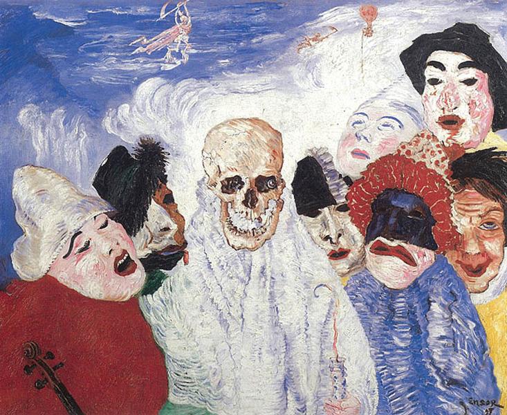
Ensor, James. Death And The Masks. Digital image. WikiArt. WikiArt, n.d. Web. 19 Jan. 2017.
|
The piece "Soliloquy" draws inspiration from the work of Mark Rothko and the art movement Expressionism. Considered to be one of the originators of Color Field painting, Mark Rothko's work focused on pure abstraction free from traditional forms and figures. His most iconic works feature rectangular blocks of color on top of a field of color. Rothko considered his work to be filled with ideas and depth. Furthermore, his work was a response to a world that he believed limited the artists' ability to express themselves. Rothko believed that artists should be able to express their ideas in any manner they desired. Therefore, his Color Field pieces are a celebration of the artist's freedom of expression and creative liberty. I aimed to capture a similar sense of abstraction in the background of my piece. In "Soliloquy", the left and right canvases show two colors converging into a third in the middle canvas. While my piece does not feature hovering rectangular blocks of color like Rothko's work, it does explore the power of color as a means of expression. Additionally, the background of my piece possesses a similar inconsistent intensity as Rothko's Color Field paintings. "Soliloquy" was intended to be my depiction of myself and my story. But my representation of myself was far from realistic. I adopted the ideals of Expressionism that argued art came from the emotions and thoughts of the artist. Expressionists refused to represent things as they appeared to the eye. Instead, they depicted things as they felt they were. As shown in James Ensor's "Death and the Masks" this was often achieved through vivid colors, prominent brushstrokes, and exaggeration. My piece features some of these elements such as visible brushstrokes and vibrant hues. As such,"Soliloquy" successfully emulates Expressionism. The piece is rooted in expression and the scenes depicted are my perceptions inspired purely by emotion. I rejected reality in pursuit of an introspective truth and translated it on the canvases. My intent and technique are clearly inspired by the Expressionist movement.
Reflection
Through the completion of this piece, I have refined my painting skills, developed new ways to utilize acrylic paint, and gained a better understanding of the importance of color. Prior to this piece, my art regarded color as an arbitrary element used solely for aesthetics. But after analyzing the work of Mark Rothko and emulating the style of Expressionists, I've come to understand that color is an abstract form that possesses its own meaning. Initially, I struggled with seeing color in this way. I was hesitant to move my paintbrush because I was too focused on representing my reflection instead of my perception of myself. I overcame this difficulty by allowing my emotions to dictate my brushstrokes. Instead of thinking, I allowed the irrational parts of me to decide what the piece would become. This is evident in my color palette; I didn't consider what made sense when I painted, rather I translated my emotions into different hues and painted with them. This is why I consider "Soliloquy" a success. The piece successfully emulates the Expressionist movement by freeing the art from reality in favor of personal truth. In addition, similar to the Expressionists, my brushstrokes are visible and intentional. This aided in the emulation of Mark Rothko's Color Field paintings where his hues were of varying intensity and highly textured. Although Rothko's works and my piece are innately different due to my use of solid figures and his reliance on rectangular patches of color, both of our pieces utilize color as a medium of abstract expression. The background hues of "Soliloquy" tell a story much like Rothko's fields of color. As such, my emulation of Mark Rothko's work is, to a great extent, successful. In regards to areas of improvement, I believe my intent must be more explicit. Even though I wanted the piece to be open to interpretation, I feel as though my intent should be easier to recognize.
Meaning
"Soliloquy" is the exploration of the cause and effect relationship between time and people as well as the effect of the world on the artist. The first canvas is a depiction of me in my current state. It illustrates one of my mediums of expression: photography. The second canvas is a crosswalk sign that, to me, refers to the passing of time and the ever changing reality we live in. The third canvas is a visualization of who I will be, hence the grey hair. It also depicts my other medium of expression: poetry. There are two ways I interpret the piece. The first interpretation is fairly obvious; as time passes, artists look back in retrospect while young artists are enthusiastic about the future. Both artists generally wish they could trade places but time does not allow them such luxuries. So the young artist continues to look forward while the the old artist continues to reflect. The second interpretation is less obvious than the first; artists have a give and take relationship with the world. The photography enthusiast within me captures the world, thus I take its inspiration. The poet in me is far wiser and gives back inspiration to the world. The crosswalk sign is symbolic of this world and its mundane sources of inspiration. Essentially, the story breaks down to how the environment affects me, how I affect it, and how I am a product of what I see.
Connection to ACT
1. I am able to identify the cause-effect relationship between my inspiration and its effect upon my artwork by analyzing the use of color in my piece as a means of abstract expression. As Mark Rothko's Color Field paintings and the Expressionist movement utilized color in a similar manner to convey ideas, it is evident that my piece was inspired by Rothko and Expressionism.
2. The author's point of view regarding Mark Rothko is that he was a philosophical artist focused on advocating for the artist's idividual right to express themselves. In regards to Expressionism, the author's point of view is that Expressionists rejected Impressionism in favor of art being a matter of expression.
3. While researching, I've come to the conclusion that color is an integral element of art by which ideas and meaning are added to pieces.
4.The central theme of my inspirational research was the impact of color on art.
5. While reading my research, I inferred that Expressionists and Color Field painters believed color was an entity independent from the work they accentuated.
Sources
Websites
The Editors of Encyclopædia Britannica. "Expressionism." Encyclopædia Britannica. Encyclopædia Britannica, inc., 03 Dec. 2014. Web. 25 Jan. 2017. <https://www.britannica.com/art/Expressionism>.
The Art Story Foundation. "Expressionism Movement, Artists and Major Works." The Art Story. The Art Story Foundation , n.d. Web. 26 Jan. 2017. <http://www.theartstory.org/movement-expressionism.htm>.
The Art Story Foundation. "Color Field Painting Movement, Artists and Major Works." The Art Story. The Art Story Foundation, n.d. Web. 25 Jan. 2017. <http://www.theartstory.org/movement-color-field-painting.htm>.
The Art Story Foundation. "Mark Rothko Biography, Art, and Analysis of Works." The Art Story. The Art Story Foundation, n.d. Web. 26 Jan. 2017. <http://www.theartstory.org/artist-rothko-mark.htm>.
Books
Wilkin, Karen, and Carl Belz. Color as field: American painting, 1950-1975. New York: American Federation of Arts, 2007. Print.
Wolf, Norbert, and Uta Grosenick. Expressionism. Köln: Taschen, 2004. Print.
Elger, Dietmar, Hugh Beyer, and Ingo F. Walther. Expressionism: a revolution in German art. Köln: B. Taschen, 1994. Print.
